Flat product cards — three options
No borders, no boxed card. Square 1:1 image, refined type (Cormorant title + Inter eyebrow) — the stock card, improved. Shown on the lighter base with your real products. The only thing that changes between options is the image well.
Warm well
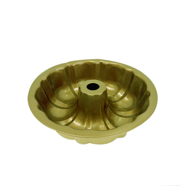
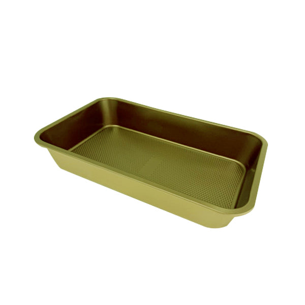
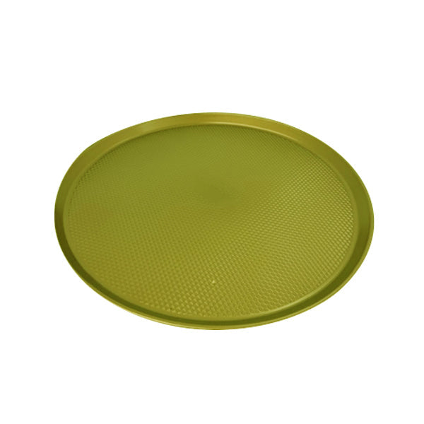
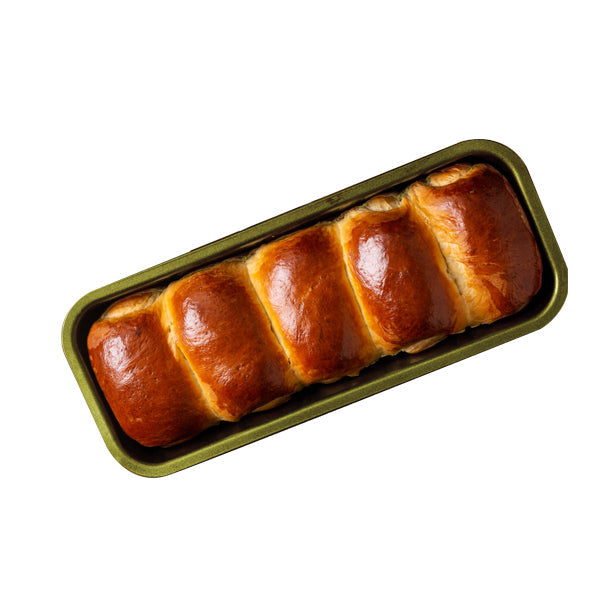
Brand-cohesive, the toaster-shot aesthetic. Product sits in a soft warm-cream tile (rounded, no border). The well gives each card a quiet shape on the light page without any line — and unifies the look even when product photos have different backgrounds.
Soft neutral well
Crisper, gallery-clean. A barely-there light tile — lets product photography read as the hero, a touch cooler and more minimal than A. No vendor dot, for the quietest version.
Open — no well
The most minimal "stock, improved." No tile at all — the product floats directly on the page, square image. Airiest and most editorial, but it depends on consistent photo backgrounds (mismatched white/cream shots will show).
A — warm well
It's the flat, borderless look you asked for, and the warm tile does the quiet "card" work that a border used to — so cards still read as distinct units on the light page. It also matches that toaster shot and normalizes inconsistent photo backgrounds, which the catalog has today. B is the same idea, cooler/quieter; C is cleanest but needs uniform photography first.
All three: no border, square 1:1 image, Cormorant title + Inter eyebrow, gentle image zoom on hover (flat at rest). Tell me a letter and I'll build it on the live theme.