Warehouse, recolored to your palette — plus #7
Same fix you asked for: keep the real distribution centre, but drop the saturated blue/orange/yellow racking and match the warm cream + neutral-taupe palette of the original warehouse I first made. Below: your colour target, the two new recolored versions (grounded on the real DC), and #7 heritage for reference.
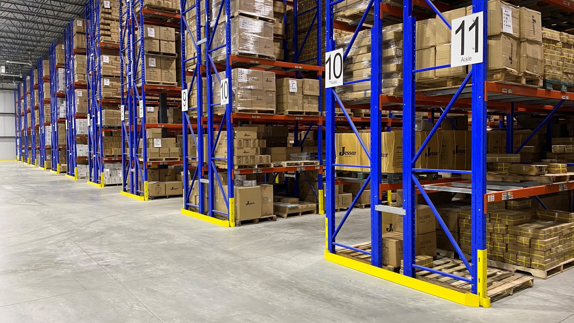
entrepot-jessar-2 from jessar.ca (60,000 sq ft, aisles 9–11). Both new versions are this facility, recolored — not a stock warehouse.
Blue/orange gone — warm palette, still your real warehouse
Recolored A is my pick: it reads unmistakably as your DC (the real aisle numbers and racking layout) while matching the original's cream + taupe palette. B is the brighter alternate. The original is shown only as the colour reference.
On #7: it's still the generated version. If you want it grounded the same way, their About page has a real team photo and a showroom shot I can base it on — say the word.