Caption band, six ways
You picked A (band below the image) — the right call, since it doesn't depend on image composition. Here are six variations of that band, same image & copy so you're judging the treatment. Layout (two-column / stacked / centered) and fill (warm / ink / none) are independent knobs — you can mix any layout with any fill.
Serif headline left, eyebrow + line right. Balanced and editorial — the version you've already seen.
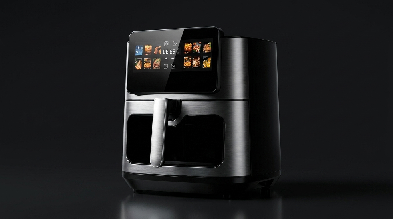
Eyebrow → headline → line, stacked left. Quiet editorial column — the most book-like, reads top to bottom.
Eyebrow → headline → line, centered. Symmetric, magazine-caption feel — the most "considered."
Dark band, light text. Same stacked layout on the Soft-Modern ink — dramatic, premium contrast. Good for a hero/feature slide.
No band — text on the page, with a short accent rule above. The lightest, most editorial. Lets the photo breathe; the caption feels like a margin note.
Bright band, hairline rule, headline + line side by side. Crisp and minimal — closest to a clean DTC caption strip.
The knobs (mix freely)
Layout: two-column · stacked · centered. Fill: warm · ink · none(rule) · white-hairline. Headline font: serif (shown) or tracked sans if you want it cooler. Any layout pairs with any fill — so "stacked + ink" or "centered + warm" are yours to choose. Tell me the combination and it becomes the band's default; per-entry overrides stay possible.
Concept artifact for selection. Copy is illustrative (air-fryer touchscreen). On the live theme the band renders from the Gallery Overlay metaobject — wording, language and style controlled in Shopify, photography untouched.