Jessar wordmark — Soft Modern exploration
A first look at evolving the Jessar wordmark toward the Soft Modern system — warm charcoal ink, refined high-contrast serif, the calm editorial register we built the site around. This is exploration, not a rebrand — direction to put in front of Jessar, not a finished mark. Two rows: AI-generated directions (mood & shape) and the same ideas hand-set in the real brand serif (crisp, vector-true — what production actually looks like).
Where it starts

Bold script wordmark · heavy weight · signature swung capital J.
The one asset worth carrying forward: that distinctive J gesture.
Row 1 · AI directions — Higgsfield, from the real logo as reference
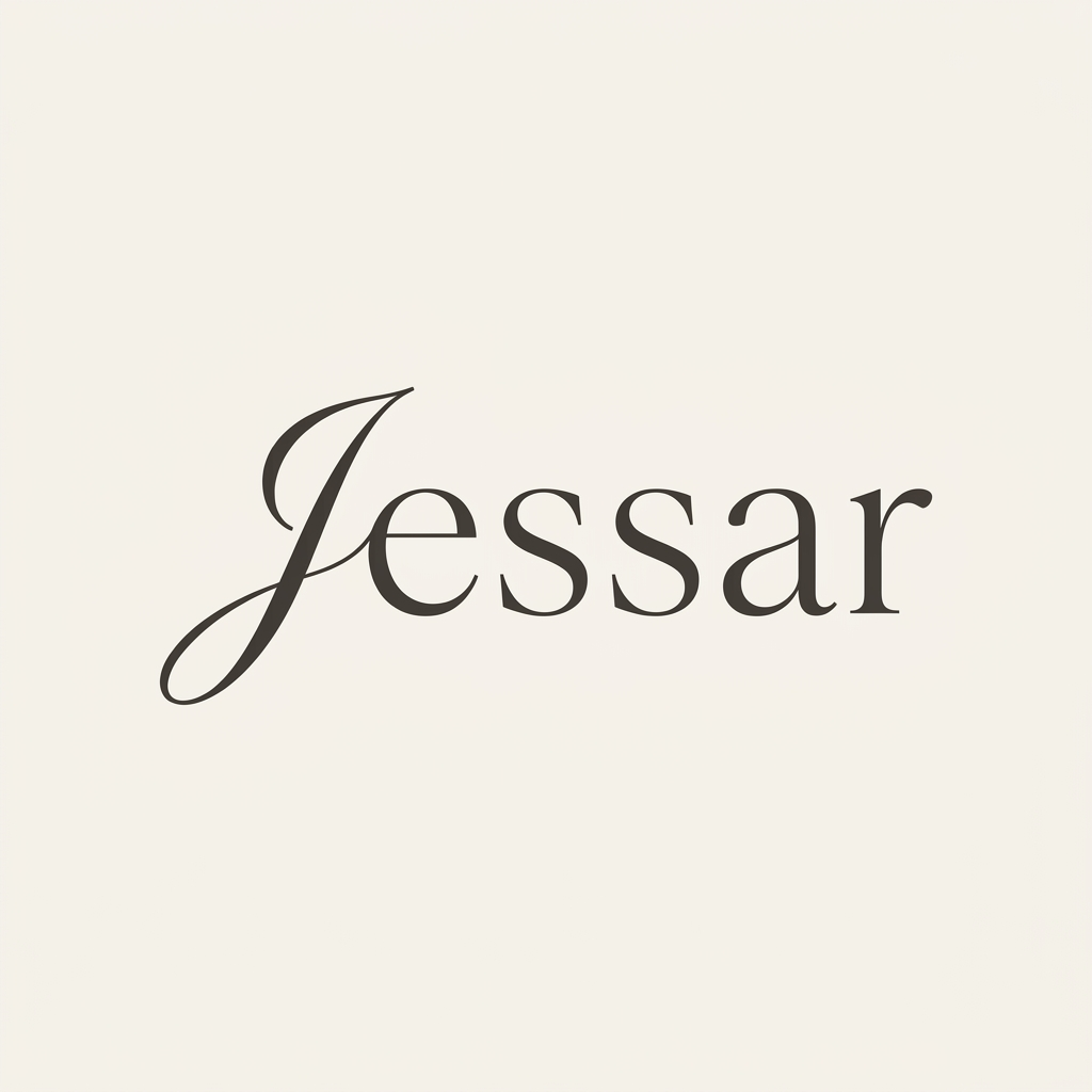
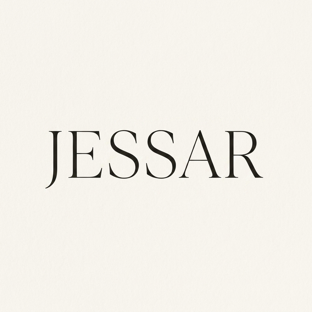
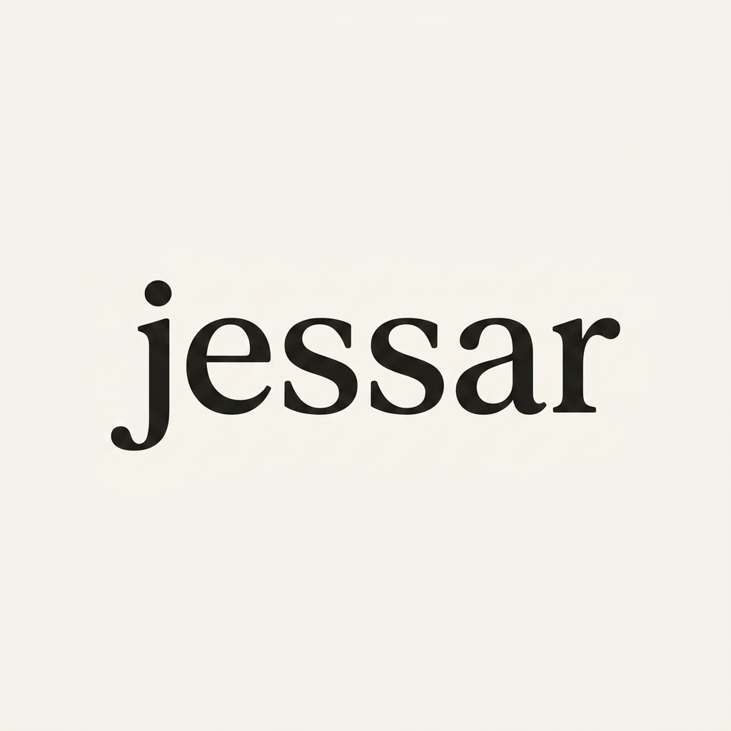
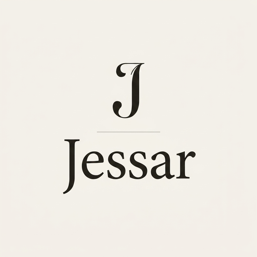
Row 2 · The same ideas, hand-set in the real brand serif — Cormorant Garamond, live type
My read: direction A — the refined swash-J is the winner. It keeps the one piece of equity in the current logo (that swung J) but re-cuts it in a high-contrast serif that belongs with the new site. The masthead caps (B) make the better favicon / collection-header lockup — so the system is likely A as the primary wordmark, B or the monogram (D) as the compact mark.
Honest caveat: none of the Row 1 images are usable as a logo file — AI type is raster, can't be recolored or scaled to vector, and the letterforms drift on close inspection. The real deliverable is Row 2 territory: lock the direction, then have it drawn as proper vector (custom-cut serif or a licensed display face) with the J as a bespoke glyph. Cheap to explore here, but a real logo is vector work.